Picture this: a potential guest stumbles upon your hotel’s website while searching for the perfect accommodation.
Will they be captivated by what they find?
Will your website seamlessly guide them through the booking process, turning their curiosity into a confirmed reservation?
That’s precisely what we aim to help you achieve in this article.
So, read on to learn more about how to make your website a lead-generating success that unlocks a floodgate of new customers.
Opt for a User-Friendly Design
In a world where users’ attention keeps getting shorter, the real winners are those who opt for a sleek, user-friendly experience.
No need for over-the-top embellishments; a simple website is the secret ingredient for keeping the visitors on the page for as long as possible and increasing the odds of them converting into paying customers.
User-friendly design includes:
- Concise messaging
- Intuitive navigation
- Fast loading
- Clear calls to action
This point is supported by a GoodFirms survey, outlining common mistakes in design that make people abandon a web page.
Here are the six most frequently cited ones.
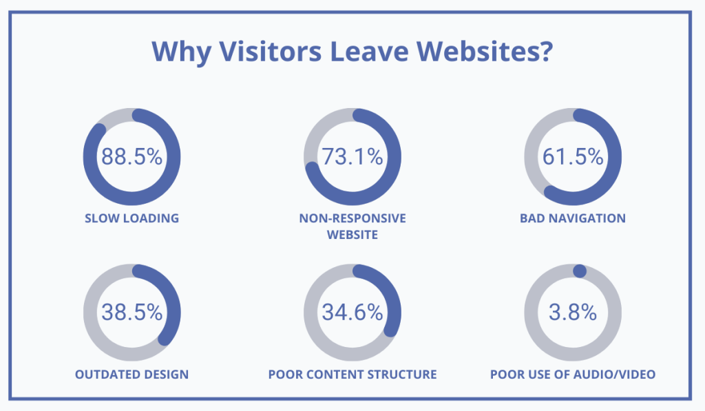
Illustration: WebBookingPro / Data: GoodFirms
Users form lightning-fast opinions about a website, so if it takes too long to load or your messaging appears messy and confusing, they are highly likely to leave, jeopardizing your chances of securing a booking.
But web design isn’t only about aesthetics. It’s all about making it easy to use.
So what makes a website easy to use?
According to Brendan Veary of Pebble Design, it’s about reducing the complexity.
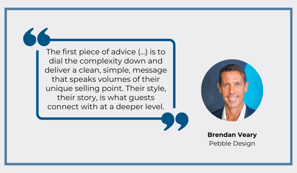
Illustration: WebBookingPro / Info: SiteMinder
If you manage to simplify your copy and accentuate your hotel’s unique selling proposition (USP), your website can be a potent marketing tool, he says.
Therefore, each page on your website should look professional and clearly communicate its purpose, enabling users to quickly find what they are looking for without wading through a sea of unnecessary details.
In short, the simpler, the better.
One way to achieve this simplicity is to pay attention to even the smallest of things.
For example, look at the fonts and colors you’re using.
Is the font too small or too hard to read? Is there a low contrast between the background and the text? Is there too much text in one text box?
People come to your site to find certain information or book a room, so your goal should be to make that process as easy as possible.
If they can’t even read what’s written on the site, you have a problem.
Consider the Hotel Lone in Rovinj, Croatia as an example.
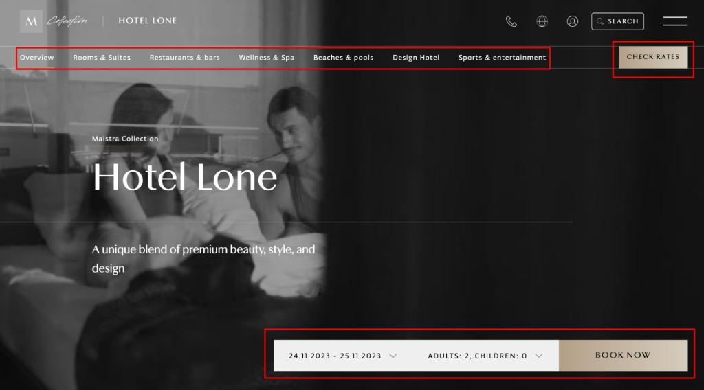
Source: Hotel Lone Rovinj
The top of their homepage offers a user-friendly experience without sacrificing an elegant and compelling layout, and as such it serves as proof that websites can be both beautiful and functional at the same time.
It has a superb header navigation for those wanting to explore more and even two CTA options:
- One for those who are ready to book
- One for those who need to check the rates first
The only thing that could make the user experience even better is having a static background instead of a video as it’s distracting.
However, it’s important to note that ensuring a great user experience with your website is not reserved just for the desktop version anymore.
With approximately half of the global web traffic coming from mobile devices, having a mobile-friendly website for your hotel isn’t a choice—it’s a necessity.
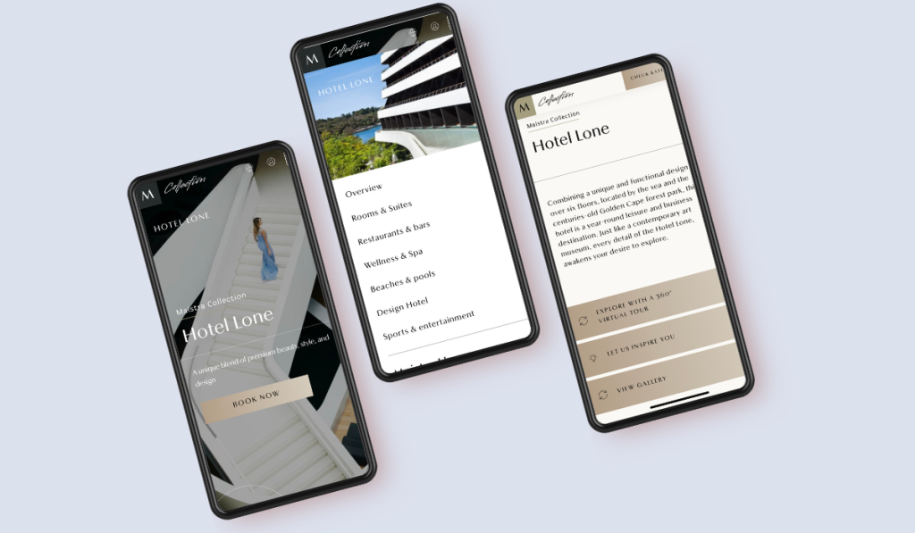
Source: Hotel Lone Rovinj
In other words, neglecting mobile optimization risks waving goodbye to a sizable chunk of potential visitors, and if mobile device users have trouble using the site, they probably won’t bother to visit it again.
Overall, when it comes to website design, it’s crucial to provide the user with the best experience.
And while it’s tempting to explore various fonts, color palettes, and other elements, too cluttered of a page is just counterproductive.
So, to get the most out of your site, use the following rule of design as a mantra and let it guide your decision-making: you confuse, you lose.
Include Call to Action Buttons
Your website has a purpose—to prompt visitors to take specific desired actions, which ultimately include booking a room.
That’s why almost every site has those small text boxes saying “Book Now” or “Check Availability”.
These are called call-to-action (CTA) buttons.
Since they need to attract attention and motivate users to act on a desired action, CTAs need to be strategically placed on your website and really well-designed.
So, how do you create an eye-catching call-to-action button?
To do it properly, focus on the following elements:
- Size
- Color
- Positioning
- Copy
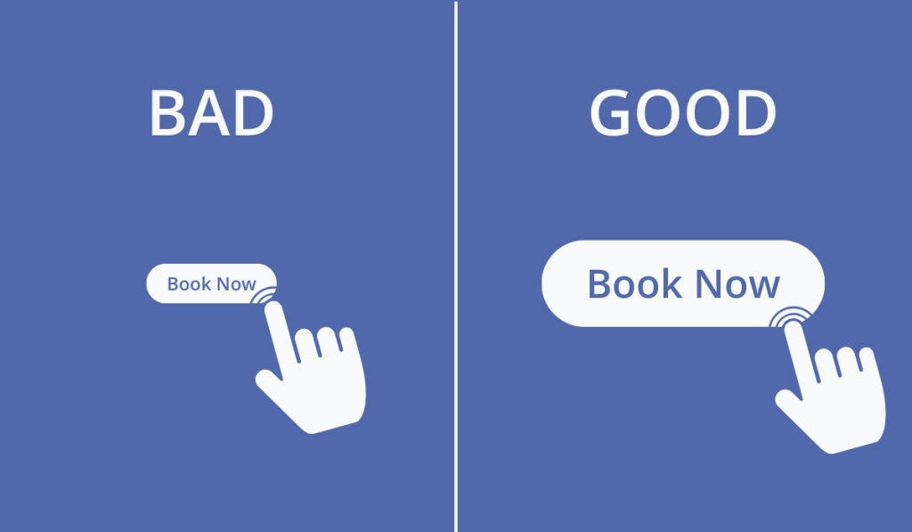
For starters, the button should not be too small, as it might go unnoticed, but it shouldn’t be too big either as it may be overwhelming.
Therefore, strive for proportionality to your site, ensuring the button is easily noticeable and clickable across all devices.
Source: WebBookingPro
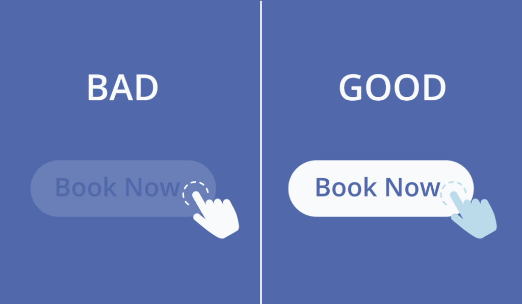
Apart from the size, the choice of color is also crucial for making your call-to-action button stand out effectively.
CXL company drives this point home with an in-depth analysis comparing the performance of red versus green CTAs in multiple case studies, consistently finding that the red button outperformed the green one.
While this doesn’t mean all your CTAs should be red, it emphasizes the importance of color in CTA design within the context of your website.
In other words, color should provide contrast with the background while harmonizing with the overall color palette.
Source: WebBookingPro
Oh, and steer clear of gray, as it is often associated with dead links.
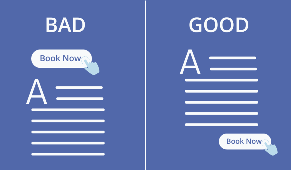
The main job of a CTA is to answer the question “Where should I click to complete a certain step?” and to do it as quickly as possible.
Poor button placement makes it harder for leads to find an answer to that question.
Considering the usual “Z” reading pattern from left to right and top to bottom, placing the CTA, for example, on the right bottom of the screen would align with the individual’s natural eye movement.
Source: WebBookingPro
So first, a user reads, say, a description of a room, and then they complete an action, i.e., book the room.
This strategic positioning facilitates a seamless flow, mirroring a real-life conversation—read, understand, and act.
Keep in mind, though, that different placements work for different sites, so make sure you test different buttons every once in a while.
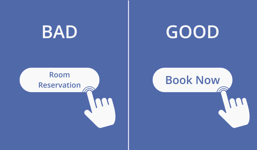
In terms of language, it’s important to keep CTA messages short, direct, and action-oriented.
The goal here is to eliminate ambiguity and ensure users immediately comprehend the action tied to the button.
Source: WebBookingPro
A clear, concise message, starting with a verb, can be remarkably effective in prompting visitors to take that desired step.
To sum everything up, this seemingly modest button holds the potential to significantly affect your website’s success in lead generation.
So, invest time in thoughtful design as well as strategic placement and its impact on your page’s performance might just surprise you.
Enable Direct Room Bookings
If you’re not offering direct room reservations on your website, why do you even have it?
You need to be providing this option, otherwise, you miss out on so many potential guests, 30% of them, as a matter of fact.
MarketSampler conducted a survey of people’s travel habits to better understand their booking preferences.
The findings revealed that slightly over 40% of respondents prefer using Online Travel Agencies (OTAs), while nearly 30% still favor making reservations directly, with individuals in their 30s and 40s exhibiting the strongest preference for direct booking.
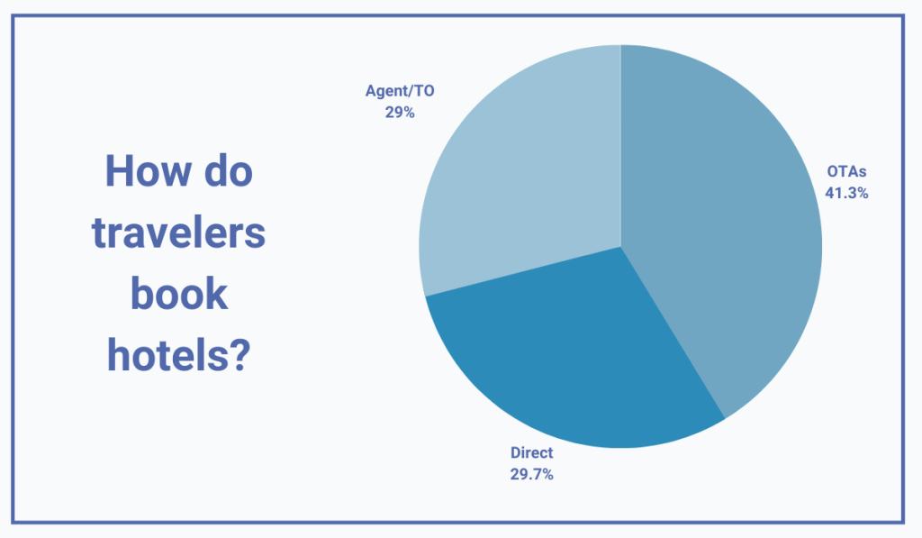
Illustration: WebBookingPro / Data: MarketSampler
In short, the study shows that direct room reservations are still a preferred option for many.
Interestingly, the allure of OTAs seems to be somewhat waning, with more users returning to direct bookings, partly because the prices these third-party sites offer are not as low as they used to be.
Additionally, there appears to be growing mistrust among travelers towards OTAs, mostly driven by occasional security problems.
For example, just recently, Booking.com’s customers were targeted by scam emails asking for their credit card details.
Naturally, such an event immediately sparked a conversation about the disadvantages of indirect bookings.

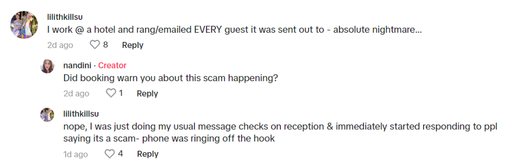
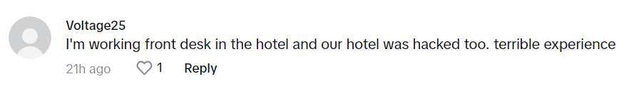
Source: @nandinigotbored on TikTok
Enabling guests to book a room directly on your website doesn’t only bypass the issues third-party websites face, but also makes for a more seamless, quicker, and enjoyable booking experience.
Since it all happens in one place, guests don’t have to go through a disjointed process, as they would with third-party sites.
Using a reliable booking engine, such as our own WebBookingPro, further enhances the experience and reduces the likelihood of booking abandonment.
Our system, easily installed on your website, allows users to check room availability and make reservations seamlessly across all devices, operating systems, and browsers, all without compromising your brand identity.
Take a look at the booking page below, showcasing a hotel using our solution.
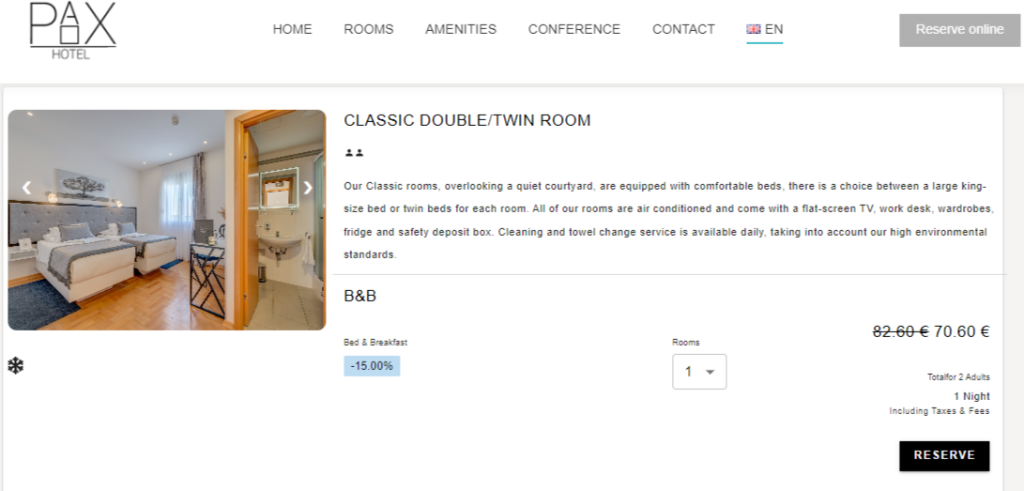
Source: Hotel Pax Split
As you can see, it fits perfectly into the site, providing a sleek, smooth, and straightforward experience.
So, how do you get started with using Webbookingpro?
It’s easy as 1,2,3:
- Our team analyzes your specific business needs and shows you around the software.
- We quickly transfer you from another Channel Manager if you’re using one.
- The booking engine is installed on your website within minutes.
We realize that every change can be challenging, especially when it comes to new technology adoption, and that’s why we offer free customer support and onboarding.
Switching to Webbookingpro is anything but complicated.
All in all, in an environment where user experience and trust are paramount, embracing direct bookings with Webbookingpro emerges as a strategic move for any modern hotelier.
Failing to seize this opportunity to increase bookings would certainly be a missed chance.
Make Contact Information Readily Available
If you want your website to generate more leads for your hotel business, make sure potential guests can contact you easily.
It’s reasonable to assume that first-time website visitors may not immediately proceed to make that room reservation. Many potential guests will need additional information and would like to speak to someone from the hotel.
This is because, at this point, they are only at the beginning of the so-called sales funnel, doing their research and getting familiar with what you offer.
And here’s your golden opportunity—make that research phase a breeze!
Think about it.
If the leads can’t easily reach out to you with their burning questions, they might just leave your site feeling annoyed and not very likely to return, because, let’s face it, a frustrated visitor isn’t exactly the ideal candidate for future bookings.
So, step one: make sure contacting you is as easy as possible.
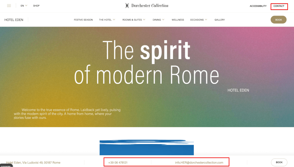
Ensure that you provide multiple contact options such as a phone number, email address, or links to social media.
Hotel Eden in Rome does this well: they have a visible telephone number and email address bar on their website’s homepage as well as a separate contact page.
Source: Hotel Eden | Dorchester Collection
This variety of alternatives ensures that even if, for instance, a phone line is busy, customers have other means of reaching you.
This not only enhances trust but also nurtures customer loyalty through meaningful connections.
Naturally, presentation matters, too.
Therefore, make all this information easily accessible and present it in a simple format that complements the overall aesthetics of the website.
Need more inspiration?
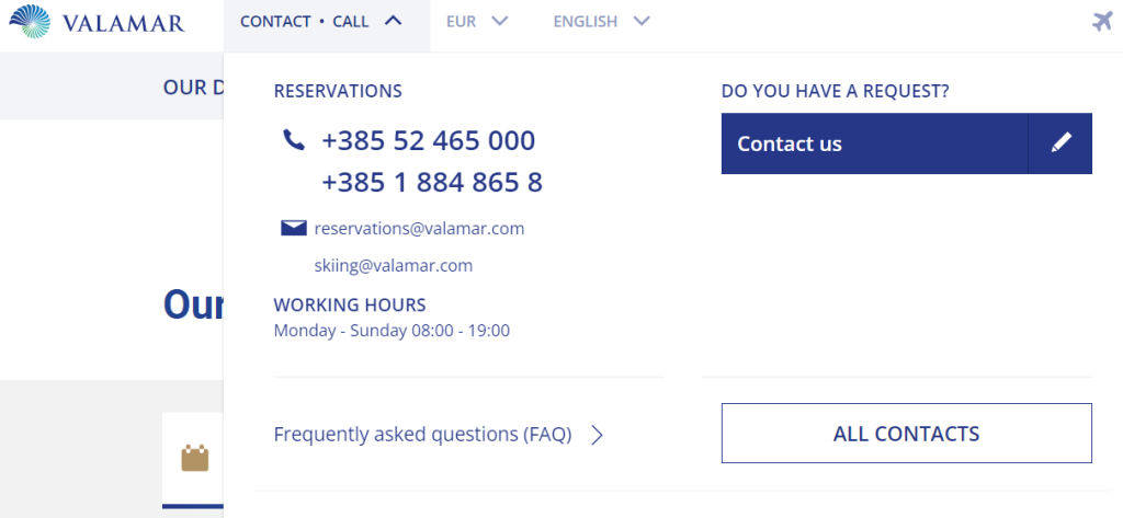
Take it from Valamar, a popular hotel chain in Croatia.
Source: Valamar
They prominently display phone numbers and email addresses for reservations and inquiries, along with clearly outlined working hours.
What’s more, they provide a link to their FAQ section, allowing the users to access additional information about bookings and get some of their questions answered even before reaching out directly.
Why not let your page do the talking for you?
After all, every click is a step toward turning these curious visitors into paying guests.
Conclusion
In conclusion, there are two boxes your website needs to check in order to become a lead-generating powerhouse. It must be both useful and user-friendly.
Put differently, it should provide users with all the necessary information, offering everything they need to know while narrating your establishment’s story in a manner that resonates and excites them.
It should also present this information in a clear way.
Once they come to the website, users should immediately know where to click to find what they seek without being overwhelmed by a messy and cluttered appearance.
By meeting these essential criteria, your website can unlock its true potential, captivating users, prolonging their online sessions, and ultimately translating engagements into room bookings.